Assembly Required.
- Stay Connected
- Subscribe to our newsletter for updates and exclusive content
Until There’s Nothing Left to Remove
What woodworking taught me about restraint, simplicity, and knowing when a logo is finished.
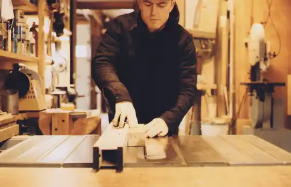
I approach logo design more or less the same way I approach a piece of wood: remove everything that doesn’t need to be there.
This is either a design philosophy or a very elegant excuse for making a tremendous amount of sawdust. Or both.
Woodworking is a hobby of mine. Or was, until two awesome kids entered my life. I occasionally make small pieces of furniture. I carve utensils. I’ve been known to turn bowls on a lathe. And somewhere along the way, I realized that the part of my brain responsible for shaping a piece of walnut is apparently the same part responsible for shaping a brand.
Both begin with too much. A block of wood contains a thousand possible objects. The job isn’t to add one, it’s to find the one already hiding inside and remove everything around it without screwing up. Because woodworking teaches you a particularly unforgiving lesson: you can always take more away. Putting it back is another matter.
Logo design works much the same way. My instinct is almost always subtraction. Fewer lines. Fewer shapes. Fewer clever little ideas elbowing one another for attention. I want to know how little we can use while still saying everything that needs to be said. Not minimalism for minimalism’s sake, but economy. Restraint. The confidence to stop talking.
Traditional Japanese woodworking has long understood this. Its joinery can be extraordinarily complex, yet the finished object often feels almost impossibly simple. The intelligence is there, but it isn’t screaming about it. The joints disappear. The construction serves the whole. Nothing feels decorative simply because someone had room for decoration.
That’s the standard.
Of course, sometimes less is just less. Some brands need ornament. Some need complexity, eccentricity, even a little glorious excess. But I almost always begin with the belief that a logo should earn every element it keeps.
So I cut. Then cut again. I remove the unnecessary line. The redundant shape. The idea that seemed terribly clever at 11:30 the night before. I keep going until removing one more thing would make the whole thing fall apart.
And there it is.
In the end, I want to create a logo the way I want to create a chair, a spoon, or a turned bowl: something that feels considered from every angle. A logo for your brand that, figuratively speaking, I could hold in my hand. And one that feels good there.
